
Refined Design Direction for Elevated Brands
AtelierLuxe Design Ltd supports specialist design enquiries for brand identity, visual direction, digital presentation, marketing assets, product styling, and premium commercial design systems.
A boutique specialist design studio for businesses that need a more elevated, coherent identity — shaped with editorial care and commercial clarity.
AtelierLuxe Design Ltd is a UK-based specialist design studio focused on brand identity, visual direction, digital presentation, marketing assets, product styling, and premium commercial design systems. We support design enquiries from founders, boutique businesses, lifestyle brands, service providers, consultants, hospitality teams, and e-commerce brands.
The approach is considered rather than templated: understanding the brief, audience, intended use, and required deliverables before shaping design direction around an agreed scope. Visual direction can help create a more refined brand presence — though commercial outcomes are never guaranteed.
About the studioDesign services, considered end to end
Six specialist areas that can be approached individually or brought together into one coherent system.
Brand Identity
Logo direction, colour systems, typography, and visual language brought together into a coherent identity.
- Logo direction
- Colour systems
- Typography
- Brand guidelines
Visual Direction & Creative Strategy
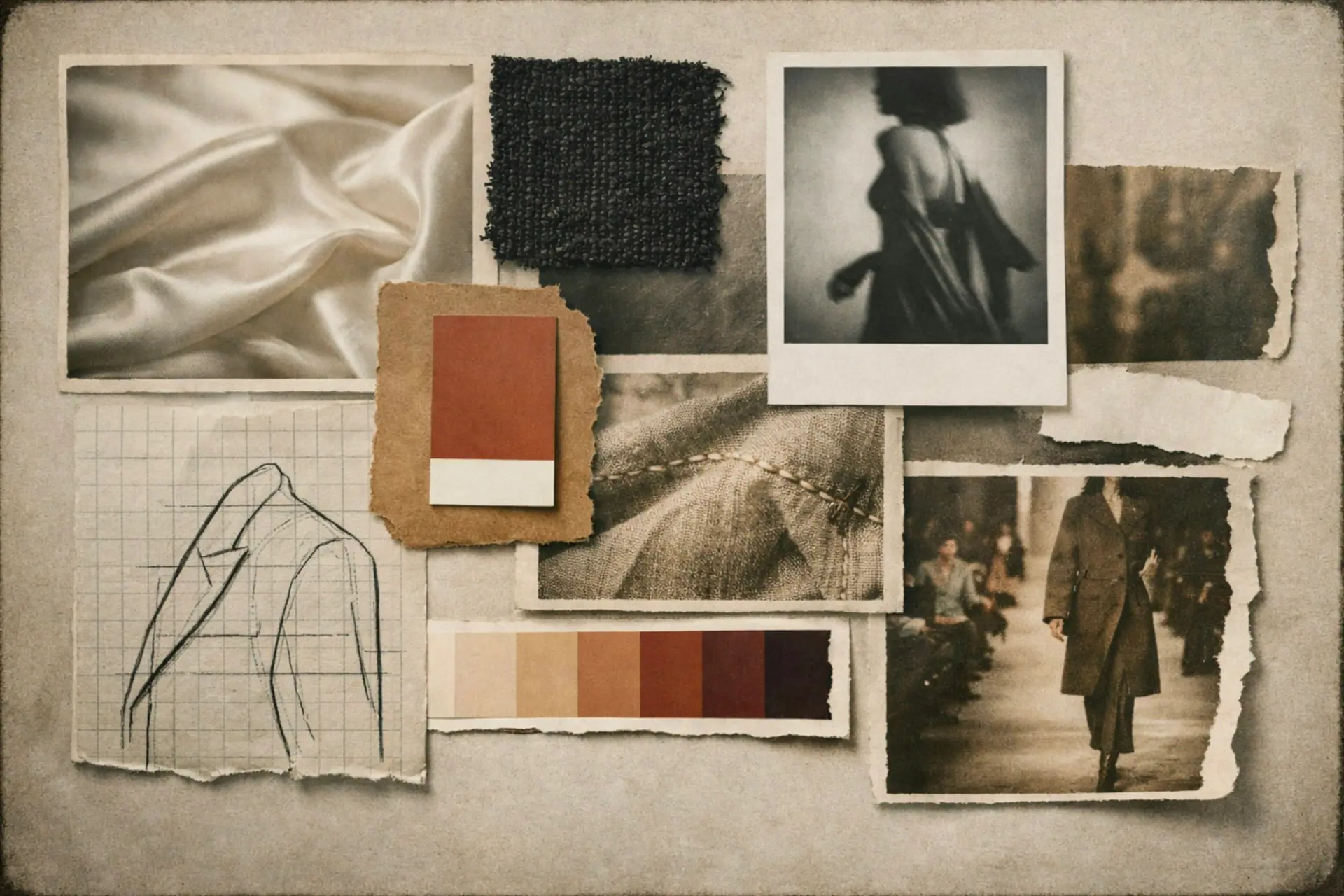
Moodboards, art direction references, and tone development that give a brand a clear, considered point of view.
- Moodboards
- Art direction
- Tone & personality
- Style systems
Digital Design & Web Visuals
Website visual direction, landing page concepts, UI styling, and social design systems for a polished digital presence.
- Website visuals
- UI styling
- Hero concepts
- Social systems
Marketing & Campaign Design
Brochures, lookbooks, launch visuals, and campaign assets designed to present offers with confidence.
- Brochures
- Lookbooks
- Launch visuals
- Social graphics
Presentation Design
Pitch decks, proposals, media kits, and product sheets shaped into clear, premium commercial documents.
- Pitch decks
- Proposals
- Media kits
- Product sheets
Packaging & Product Design Direction
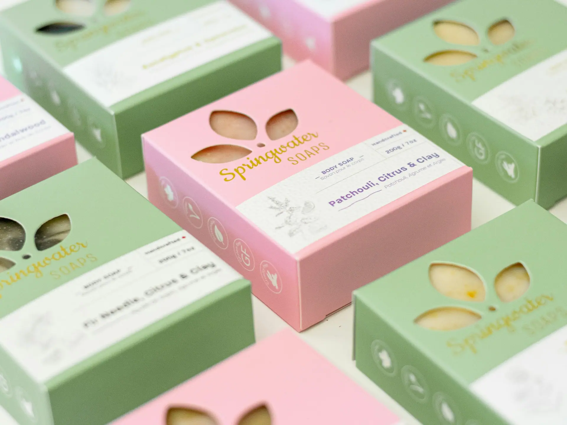
Packaging concept direction, label styling, and retail presentation that gives products a considered shelf presence.
- Packaging concepts
- Label styling
- Retail presentation
- Look & feel
Interior, lifestyle & spatial design support is also available as visual and presentation direction — styling, mood, and brand presentation rather than regulated architecture or interior design services.
Six considered stages, from first brief to final files
A calm, transparent process that keeps every project grounded in the brief and the agreed scope.
-
Discover
We start by understanding the brief, audience, sector, and the intended use of every deliverable.
-
Define
We translate the brief into a focused set of requirements, deliverables, and success criteria.
-
Direction
We shape the creative direction through moodboards, references, and an agreed visual tone.
-
Design
We develop the agreed direction into considered, production-ready design.
-
Refine
We refine details through the agreed rounds of revision until the work is resolved.
-
Deliver
We prepare and hand over final files in the agreed formats, with usage notes where relevant.
A coherent identity, considered in detail
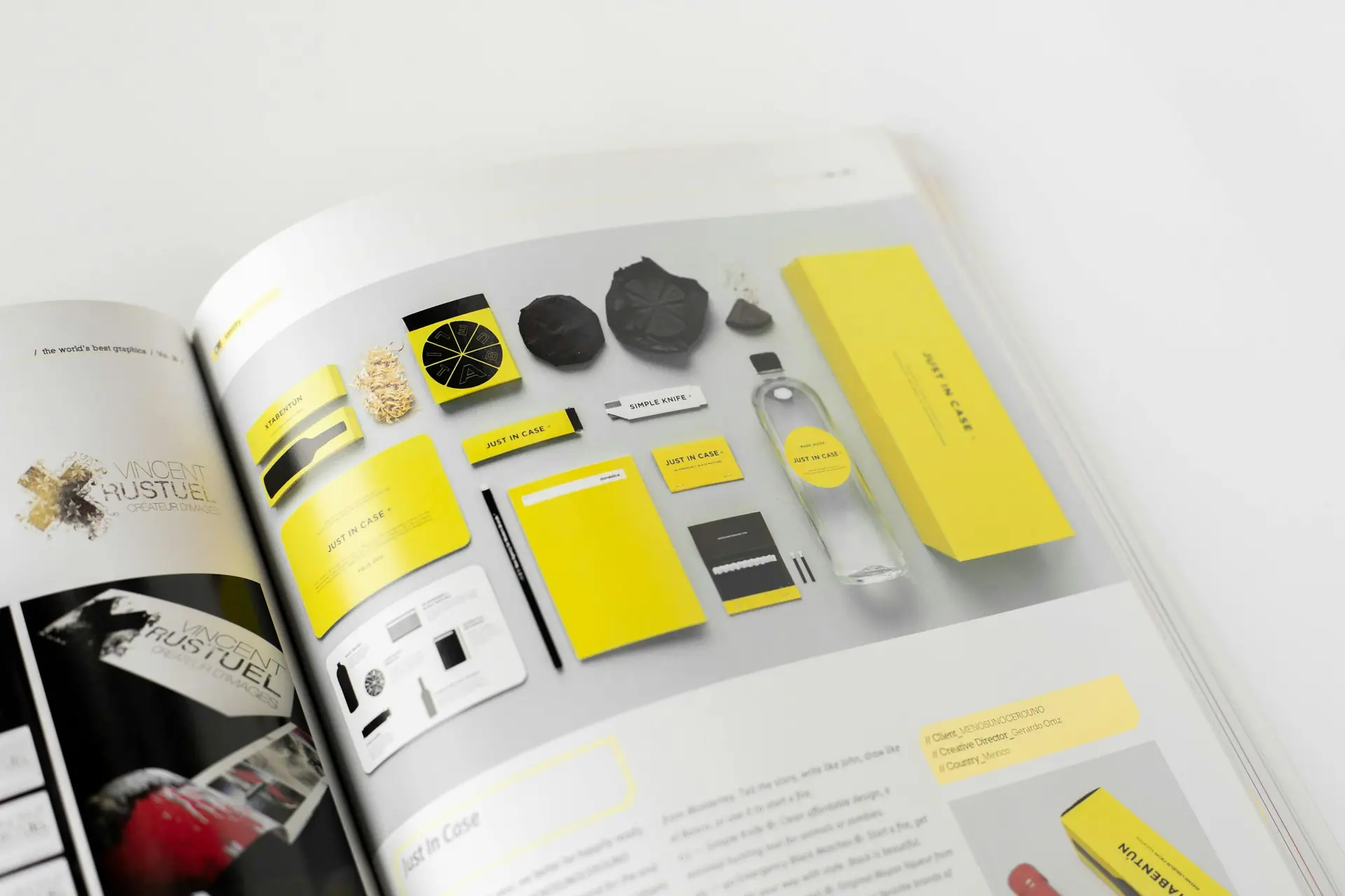
Logo direction, colour systems, typography, and visual language brought together into a considered identity — with brand guidelines that keep everything consistent as the brand grows.
Brand identity deliverables, revision rounds, file formats, usage rights, and final assets are confirmed per project.
Explore brand identity
A polished presence, online and in print
Website visual direction, landing page concepts, and social design systems for digital — alongside brochures, lookbooks, launch assets, and campaign design for marketing.
Website development, photography, copywriting, and print production can be confirmed separately with the right specialists where required.
Considered documents and shelf presence
Pitch decks, proposals, media kits, and product sheets shaped into clear, premium commercial documents — plus packaging concept direction, label styling, and retail presentation for products.
Packaging manufacture, print production, material testing, and labelling compliance should be confirmed separately with appropriate suppliers where relevant.
A design language built on restraint
Colour, type, layout, imagery, texture, and motion — held together with editorial discipline.
- Colour
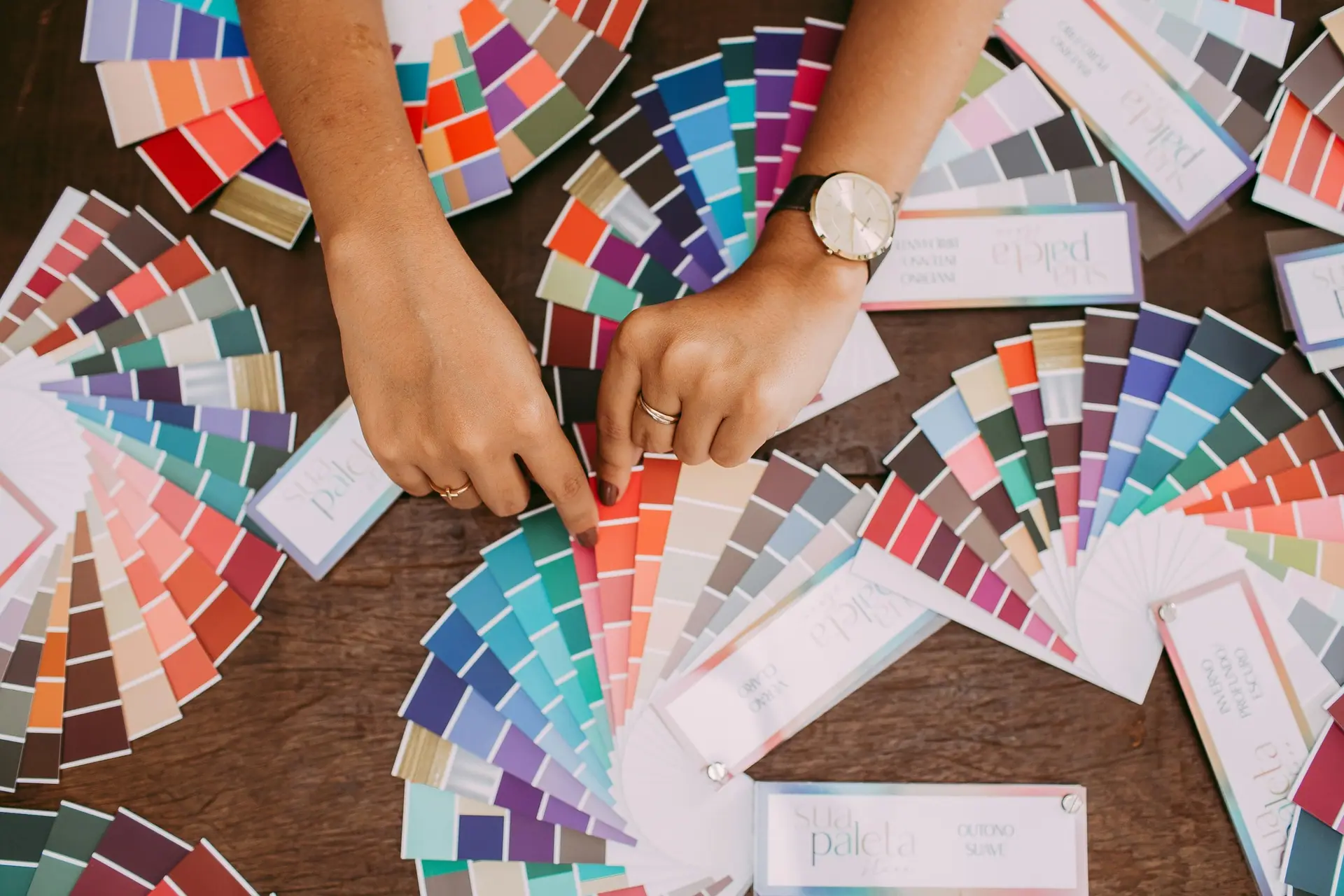
Logo-safe ivories and gallery whites, soft black contrast, champagne and bronze accents.
- Type
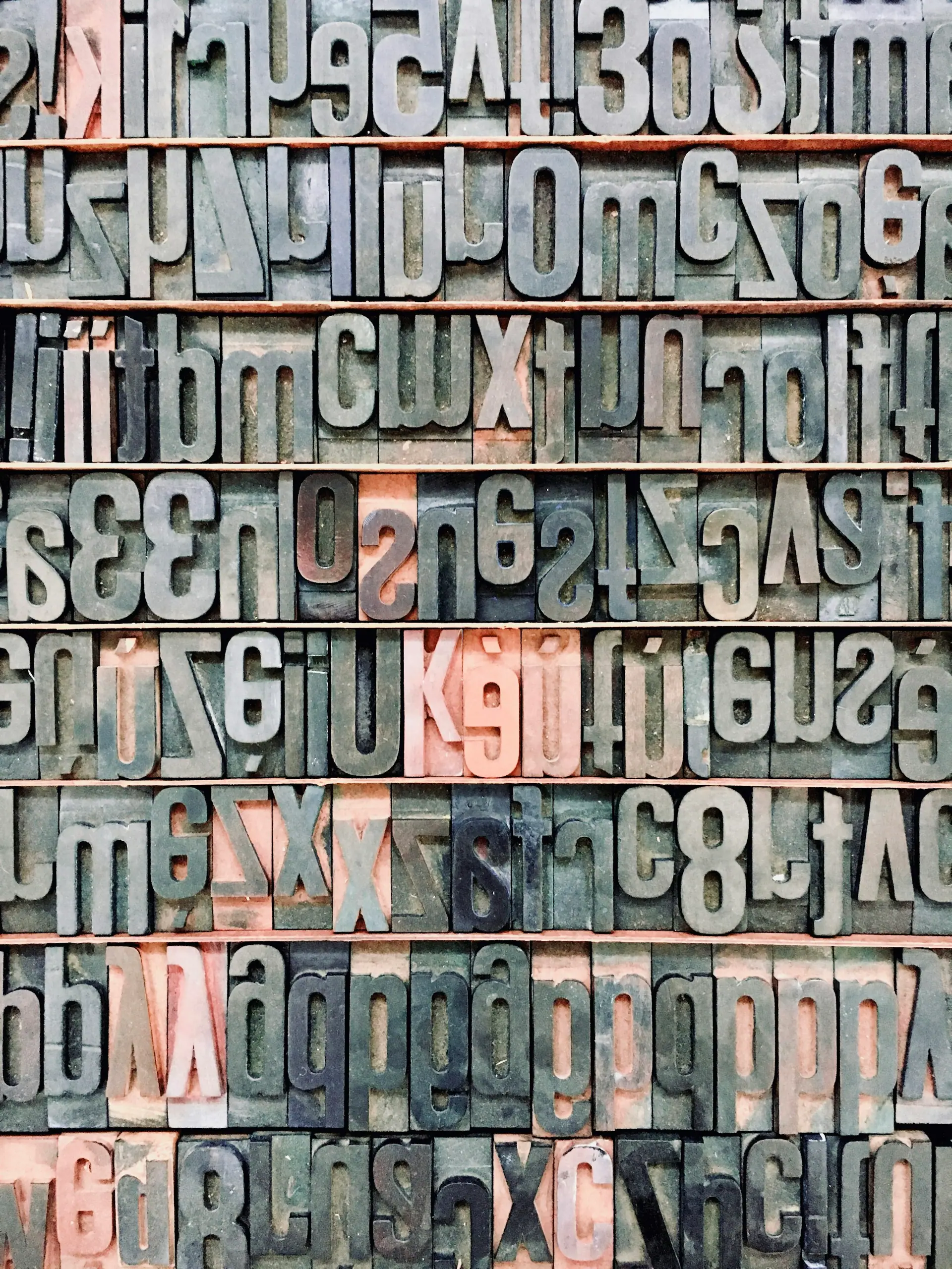
A refined editorial serif paired with calm, legible sans and design-system metadata.
- Layout
Generous whitespace, elegant grids, and considered editorial pacing.
- Imagery
Neutral, textural, atmospheric — material-led rather than literal.
- Texture
Paper, fabric, stone, ink, and soft shadow used with restraint.
- Motion
Quiet champagne line reveals and soft lifts that respect reduced-motion.
Mood, material, and tone
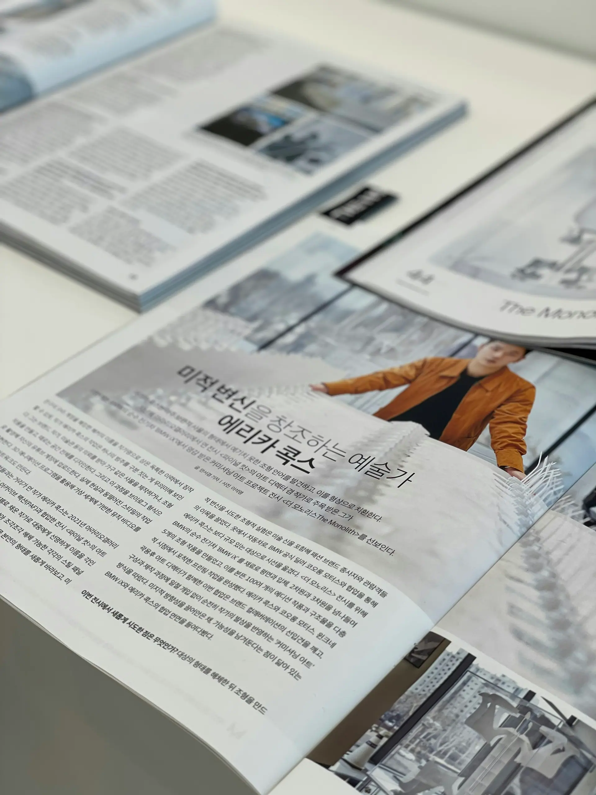
A sense of the textures and editorial pacing that inform our creative direction.
Tell us what needs to feel more premium.
Share a little about your brand, your goals, and the deliverables you have in mind. We will shape a considered design direction around your brief and agreed scope.