A coherent identity, considered in detail
Logo direction, colour systems, typography, and visual language brought together into one considered identity — documented so it stays consistent as the brand grows.
- Logo direction
- Colour systems
- Typography
- Guidelines
The building blocks of a considered identity
An identity is more than a logo. These are the elements we shape into a coherent, usable system.
- 01
Logo direction
Considered logo direction that reflects the brand’s tone, sector, and intended use — explored as part of a coherent identity rather than a single mark in isolation.
- 02
Brand systems
A connected system of identity elements — marks, lockups, spacing, and usage — so the brand holds together across every application.
- 03
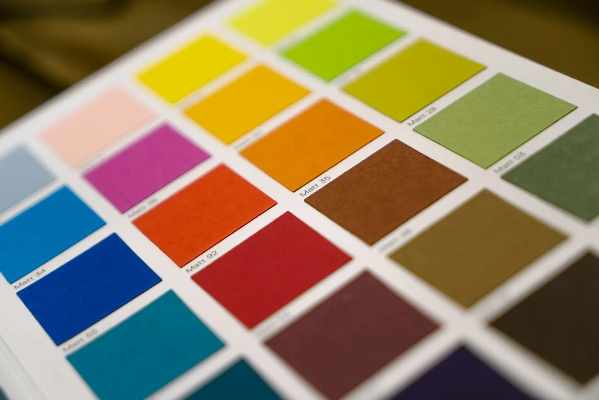
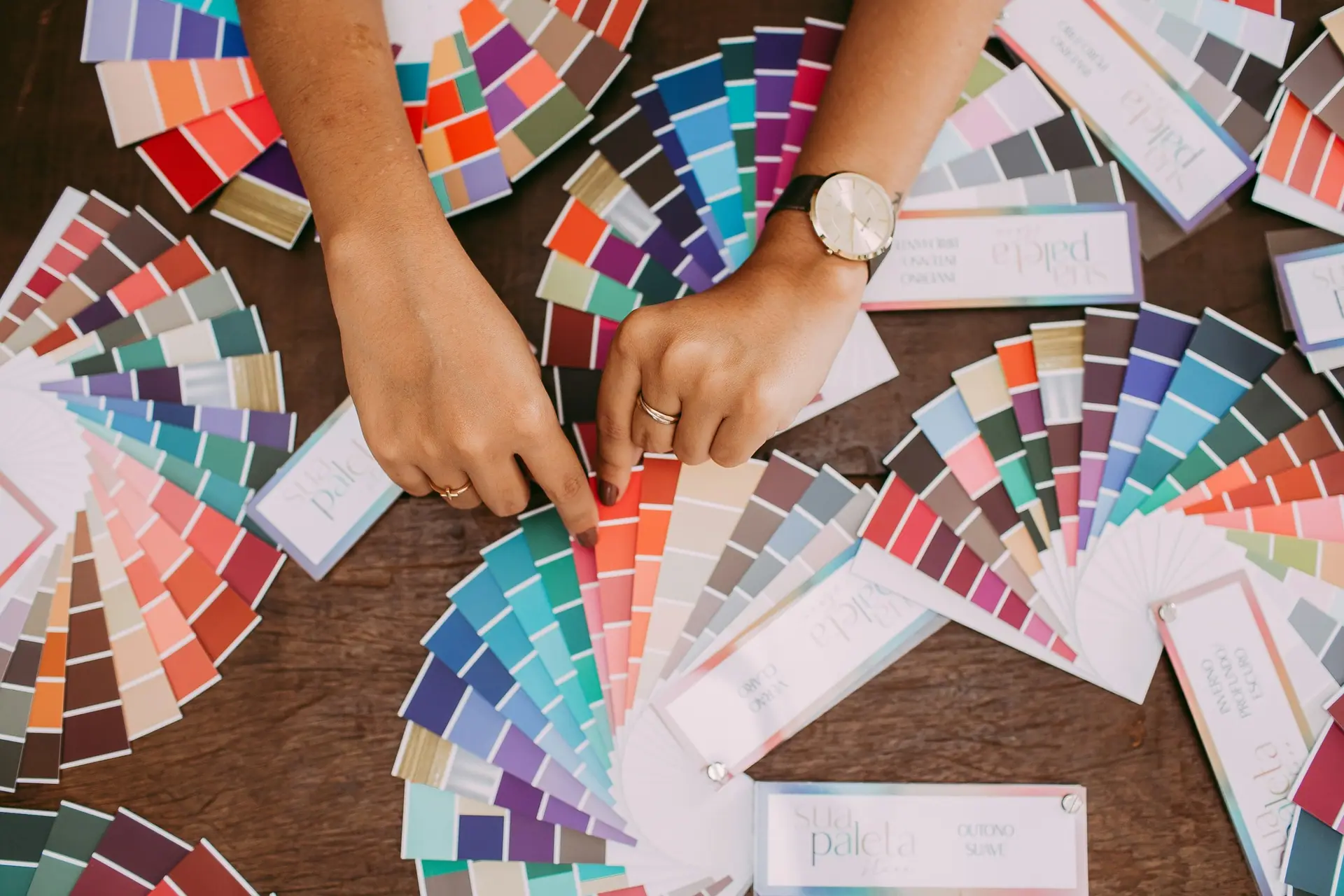
Colour palettes
Primary and supporting colour palettes built for contrast, mood, and flexibility across digital and print contexts.
- 04
Typography direction
Type pairings and hierarchy that give the brand a clear, legible, and characterful voice in writing.
- 05
Visual language
The supporting details — imagery direction, layout principles, and tone — that make the identity feel considered and complete.
- 06
Pattern & graphic systems
Optional patterns, motifs, and graphic devices that extend the identity into a richer, more ownable visual world.
- 07
Brand guidelines
Clear guidelines documenting how the identity should be used, so the brand stays consistent as more people apply it.
- 08
Identity refinement
Refinement of an existing identity — tightening, modernising, and bringing coherence to brand assets that have drifted over time.
Typography that gives the brand a voice
Type is where a brand’s personality lives in writing. We develop pairings, hierarchy, and usage that feel legible, characterful, and right for the sector — then document them so the voice stays consistent.
Brand identity deliverables, revision rounds, file formats, usage rights, and final assets are confirmed per project.
Identity, explored visually
Reference imagery used to study tone, colour, and texture — for visual context only.
Ready to refine your identity?
Share a little about your brand, your goals, and the deliverables you have in mind. We will shape a considered design direction around your brief and agreed scope.