A considered shelf presence
Packaging concept direction, label styling, and retail presentation that give products a considered look and feel — designed for impact on the shelf and in the hand.
- Packaging concepts
- Label styling
- Retail presentation
- Look & feel
Design direction for products
We shape the creative direction and visual design — the look, feel, and presentation of packaging and products.
- 01
Packaging concept direction
Creative direction for packaging — form, finish, and feel — exploring how a product should present itself on the shelf and in the hand.
- 02
Label styling
Considered label design and styling that balances brand expression with clarity and legibility.
- 03
Product visual systems
A consistent visual system across a product range, so variants feel related and considered.
- 04
Retail presentation
Direction on how products present in a retail context — display, hierarchy, and shelf impact.
- 05
Gift & product display direction
Styling direction for gifting and display, giving products a sense of occasion and care.
- 06
Packaging look-and-feel
The overall aesthetic — colour, material, type, and detailing — that defines how the packaging feels.
- 07
Production handoff notes
Design notes prepared for handoff to your chosen production partner, who confirms manufacturing specifics.
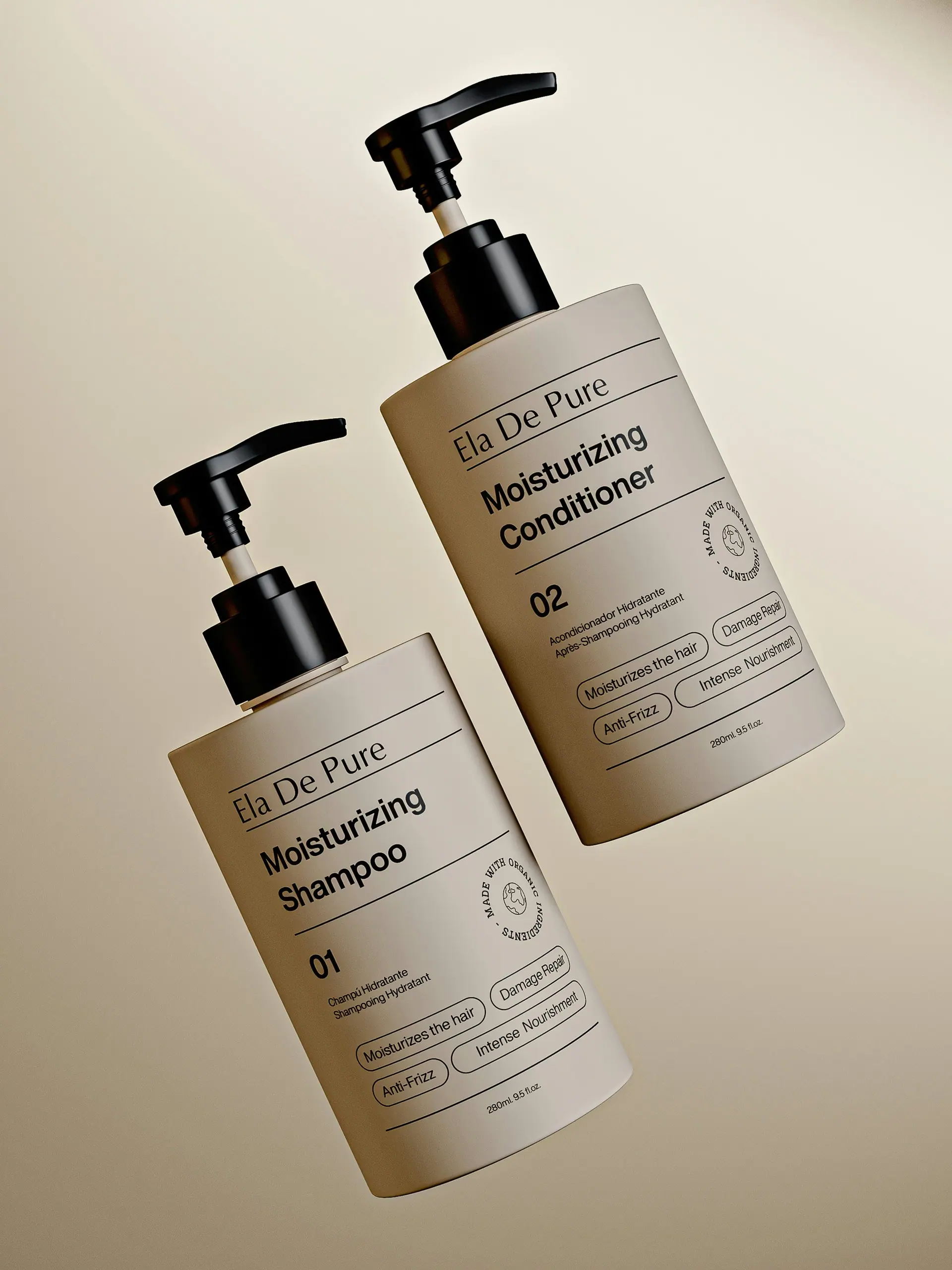
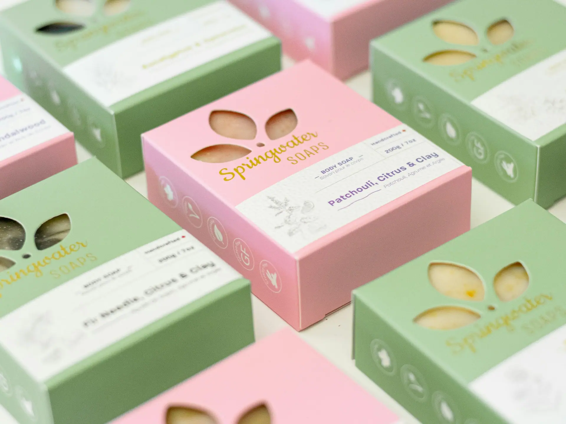
How a product presents itself
We explore packaging through concept direction, label styling, and a consistent product visual system — considering colour, material, type, and detailing so the product feels considered at every touchpoint.
Manufacturing, materials, and compliance are confirmed with your chosen production partner. Design deliverables and usage rights are agreed per project.
Tone for the shelf
Reference imagery for visual context only.

Give your product a considered presence.
Share a little about your brand, your goals, and the deliverables you have in mind. We will shape a considered design direction around your brief and agreed scope.