A clear, considered point of view
Moodboards, art direction, and tone development that give a brand a coherent visual voice — shaped around your brief, audience, sector, and intended use.
- Moodboards
- Art direction
- Tone
- Style systems
Direction before design
Agreeing the creative direction early keeps the design phase efficient and aligned to the brand.
- 01
Moodboards
Curated visual territories that capture tone, texture, and feeling before any design is committed — a shared reference point to align around.
- 02
Creative strategy
A clear, considered point of view on how the brand should look and feel, grounded in the audience and the intended use.
- 03
Image direction
Guidance on photography and imagery style — composition, colour, and mood — so visuals feel consistent and intentional.
- 04
Audience positioning
Visual choices made with the audience in mind, positioning the brand where it needs to sit in its market.
- 05
Tone & personality
Defining the brand’s visual personality — refined, warm, bold, or quiet — and expressing it consistently.
- 06
Art direction references
Reference frameworks that guide how layouts, type, and imagery come together across applications.
- 07
Style systems
A documented visual style system that keeps everything coherent as the brand produces more material.
- 08
Brand experience direction
Direction on how the brand should feel across the touchpoints people encounter — from screen to print to space.
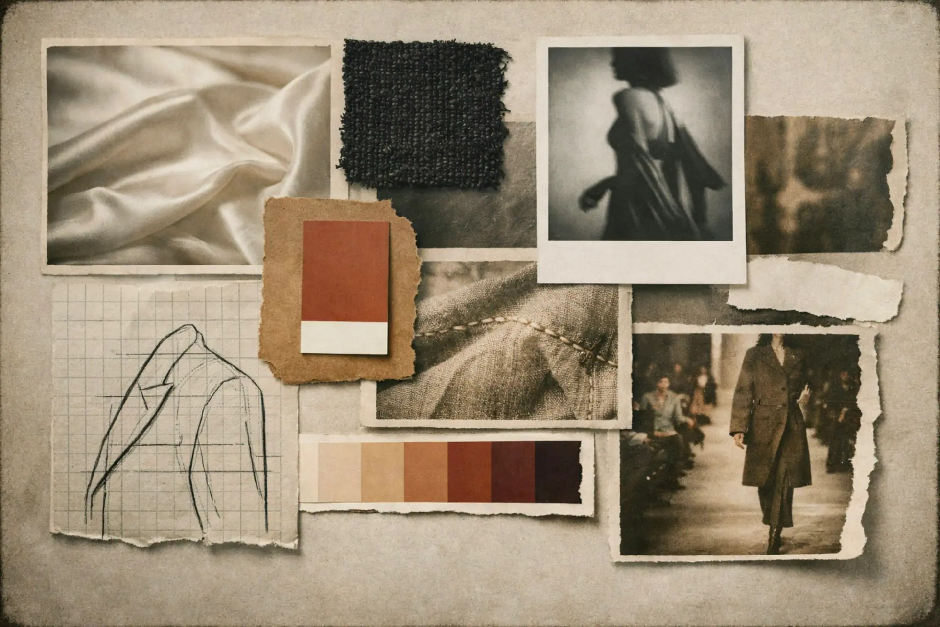
Texture, tone, and feeling
The right reference can communicate more than a brief. We build moodboards and art direction references that capture how the brand should feel — its texture, restraint, and warmth — so everyone is aligned before design begins.
Visual direction is shaped around the supplied brief, audience, sector, intended use, and agreed deliverables.
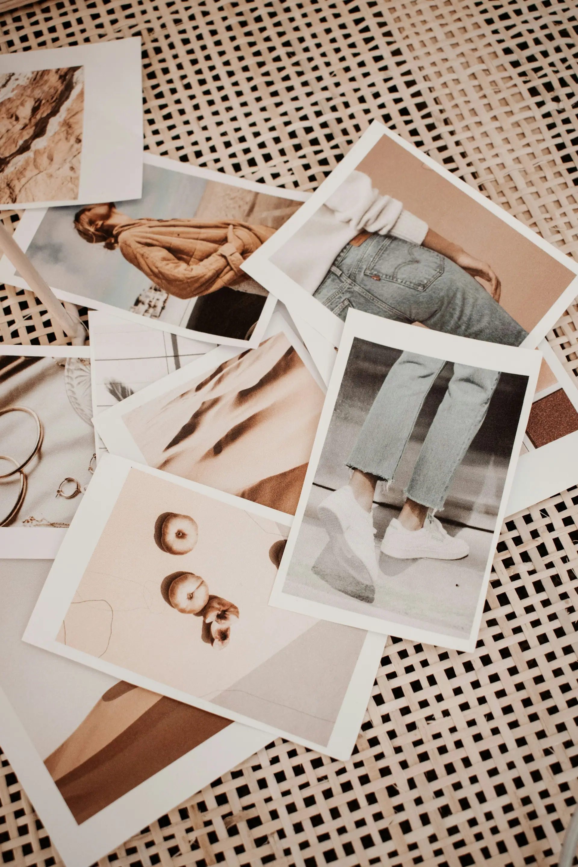
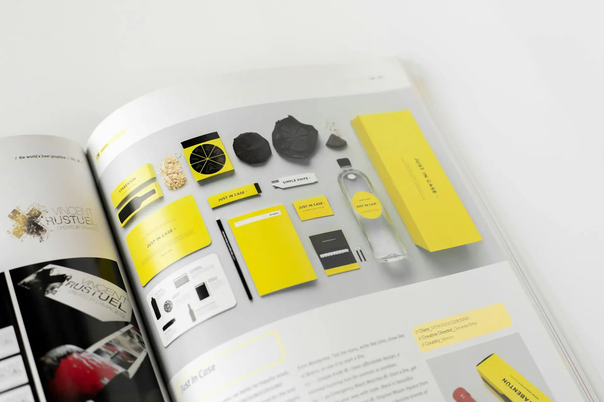
Exploring the brand’s world
Reference imagery used to study direction — for visual context only, not client work.
Give your brand a clearer point of view.
Share a little about your brand, your goals, and the deliverables you have in mind. We will shape a considered design direction around your brief and agreed scope.